#03 Pixxi is next
The pixel font you didn't know you needed, but now you do, is up for grabs!
Hello Font Fans!
This email is going out a little later than planned – my computer had an unfortunate accident with a glass of water and tragically did not survive. One very stressful week and a new machine later, I am back and happy to present Pixxi to you.
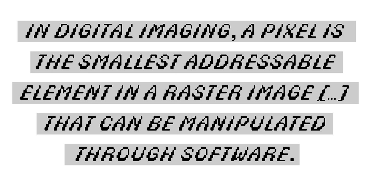
Pixxi is a pixel font – duhh – but not just any one, of course. It is a slanted, sort of bottom-heavy pixel font that comes in two “weights”. I am very excited that for the first time in FFC history, I am releasing two styles, Pixxi Liquid and Pixxi Edge. The latter is how it all started, stacked pixels, carefully arranged by moi. In addition, Liquid has smoothed edges and rounded counters.
While I can confirm that arranging pixels on an axis and considering stroke thickness and weight distribution has its challenges, this font turned out to be a lot of fun. The underlying grid freed me from the need to create perfect curves, or any curves for that matter. It provided a safe structure within which I could peacefully build my letters. A friend of mine beautifully observed that the pixels really shine when arranged at an angle, and I agree. Absolutely worth it.
I can now cross 'pixel font' off my list, although I can safely say I have a few more in me. Also, I never get tired of seeing how you use my fonts, so please link me when you do.
Now go make that backup and save your future self a lot of trouble ;).
Tamara


